Designers guide to data
March 11, 2023
Being a Product Designer requires you to have a ton of specialized skills. Visual Design, Information Architecture, Research, Product Knowledge, Design Systems and many more. It takes a long time to develop your craft.
If you work in product design long enough you may find a gap in your skills around data and metrics, these skills are more common among product managers and engineers. Skills around data and metrics can be developed over time, you can use them to increase your impact and effectiveness.
Becoming fluent in business knowledge and metrics is a great skill that designers can start to think about as they develop in their careers. Empathy for our stakeholders and colleagues can drive us to become more effective in our approach and make it easier for stakeholders to say yes.
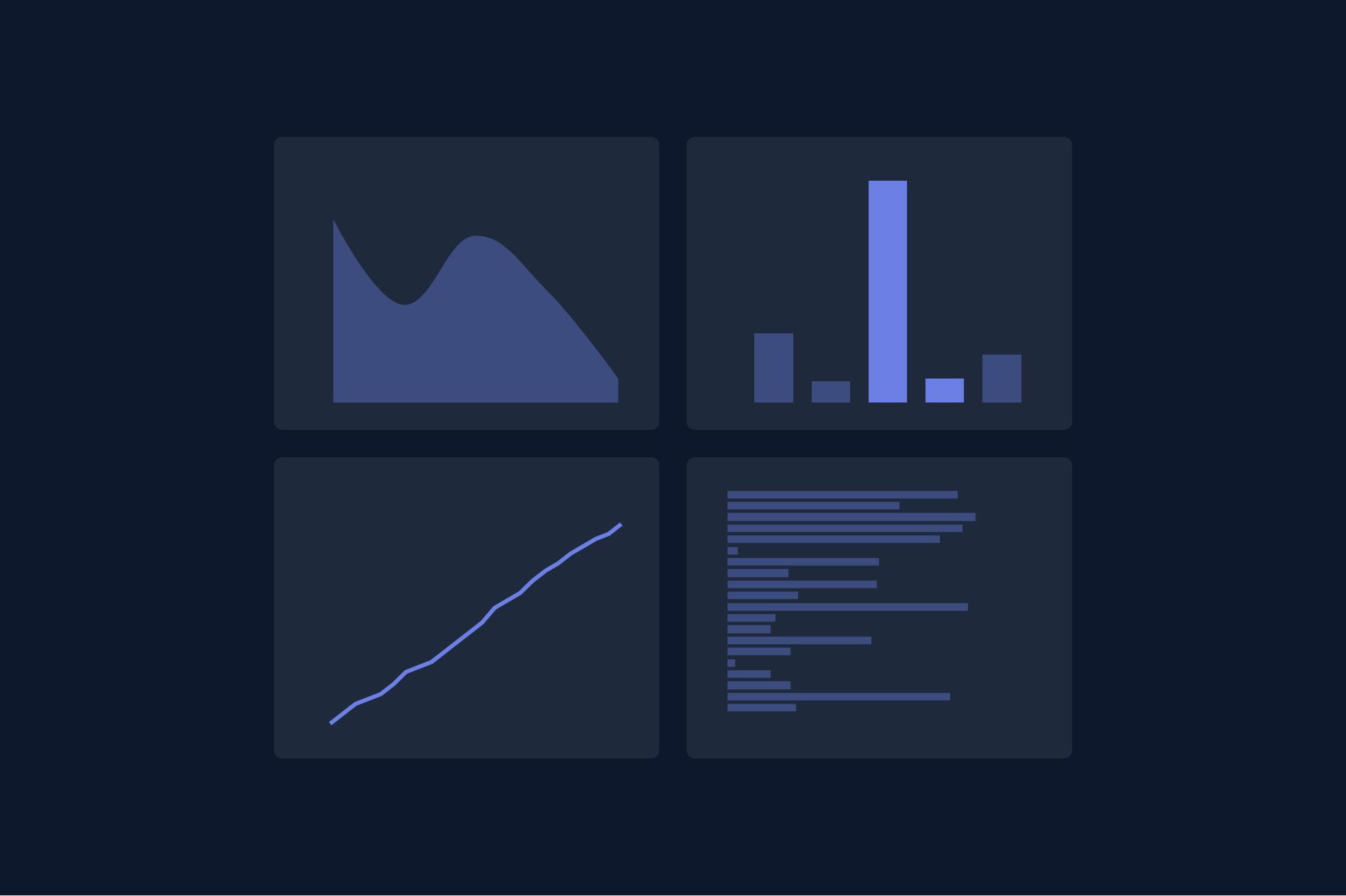
Great metrics and data should tell a story. Metrics that are hard to understand and not easily measured are not great metrics. Designers help make communication clear, and they help to make things easy to understand. They can visualize data in meaningful ways.
In this post, I’ll talk about why data is essential for design teams, the types of data that design teams could leverage, and a few ideas on how we can make data more accessible for designers.
Why is Data Important for Designers?
Designing a delightful end-to-end experience that delivers customer value is no easy feat. It's daunting, non-linear, and highly subjective. The best products in the world are often complex, with numerous interconnected features. Our customers frequently have a much different picture of our products and think about them differently than we do. They experience the product through small micro-interactions that add up to a more extensive experience. The sum of these experiences can either make or break the overall user experience. So, how can data help us in our design journey?
Protecting from bias
Great metrics can help designers protect themselves from their own biases. By understanding how customers actually use our tools, we can better meet their needs and solve problems that truly impact their behavior. Empathy for our customers is crucial for providing value.
Figuring out what is important
In day-to-day design work, it's easy to lose focus and concentrate on the wrong aspects of a design. As Jeff Bezos mentioned in his infamous shareholder letters, we should differentiate between one-way and two-way door decisions. By incorporating data into our design process, we can add context to the decisions we make and understand their potential impact.
Describing success and measuring it
One common approach to product design is working backward from the desired end state. Data can help inform our process and decisions by defining leading/trailing metrics that quantify successful outcomes. When we understand what success looks like, we can design for it.
Types of Data Designers Can Leverage
We can start to think about data and design in a couple of ways. There are many different types of data that can be available for designers.
Product Analytics
If we want to understand how customers interact with our applications and develop a quantitative understanding of aggregate usage and usage over time, we’ll use Product analytics to gather this data. You can think about this every time a customer interacts with an element on your site, we fire an “event,” noting that usage, the customer who made the event happen, and what time it occurred.
A more advanced version of Product analytics could be to use A/B Testing or Multi-variant design where we can compare usage with real customers testing alternate designs.
High-Level Metrics
If we step outside of the feature level usage we can take a look at higher level aggregated metrics to give us a quick sense of the health of the product common high level metrics we will look at might be Engagement metrics DAU, WAU, MAU — daily, weekly, monthly active usage. Using the AU strategy we can look across the product as a whole “What % of users login per week?” or we can look at active usage for individual features “What % of users use {feature} per day?”.
Other high-level metrics that interest design teams are retention metrics. Standard Retention metrics you might see would be CRR — Customer Retention Rate. The idea here is that if our goal is to deliver customer value and solve problems, we probably aren’t doing a good job if we aren’t retaining customers who are canceling.
Satisfaction Metrics
Another area design teams might consider adding to their suite of data tools could be instrumenting satisfaction metrics. The most common metric here is NPS — Net Promoter Score. A net promoter score offers users a chance to rate the product on a scale of 1-10 at key moments. NPS surveys occur a few weeks after usage, then are shown again after further usage.
Metrics in Customer Research
Frequent contact with customers and user research is critical to a great design team's role. Metrics can also play a big part in contextualizing an interview, or we can even use interviews to gather more data directly from our customers. Some strategies you might look at here would be to:
Break up Interviews with Rating Questions
During a customer interview, you can ask customers to offer a rating of 1 to 5 at the end of a research task. For instance, you might ask, “On a scale of 1 to 5, How easy was it to complete this task” or “On a scale of 1 to 5, How frequently do you see yourself using this feature”.
Contextualize User Research with Quantitative Metrics
One way to contextualize a customer interview might be to pull metrics about the customer before speaking to them. Look at the # of logins in the past 90 days or look to see what features they use most frequently. With this approach, we must be cautious in considering the customer's privacy. We don’t want to pull sensitive or private information but just give ourselves a better idea of the customer's potential skill level or engagement with our product.
Practical Tips for Working with Data
When analyzing data, you want to be mindful of the biases and discrepancies that may show themselves. Techniques we use to analyze data are aimed at evening out these discrepancies and making the numbers more actionable and valuable. Outstanding data analysis tells a story and gives context. You can use some of the concepts below as a guide for your own analysis or questions you might ask about if provided with data from others.
Transparency, showing your work
Great metrics are always transparent and easy to understand. In practice the viewers of your work should understand what data you are pulling from and be able to know how you came to your conclusion. There’s nothing worse than sharing a metric and then realizing it’s wrong, allow others to double check your work.
When developing a metric, I always try to abstract out the raw time series data, putting it alongside the aggregation so that the viewer of the work could remix and trace it themselves.
Use averages to normalize metrics
Usage analytics will frequently be full of discrepancies. Accounting for seasonality is a critical part of excellent analysis. Accounting for weekends or specific times of day where customers may vary usage helps to tell a better story. By Leveraging averages, we can get a better sense of the actual use of a feature rather than a blip in time. It’s worth noting you can also leverage median, mode or standard deviation as another strategy to normalize.
Determine popularity by looking at Events & Users
We can look at usage data through the lens of events and users. When we are looking at events it’s a bit harder to understand how much impact a feature could have. You could have a group of a few users that use a feature all the time skewing the results. Frequently it’s helpful to look at the number of users who use a particular feature to gain more insight that might give you a better sense of popularity.
Provide context and calculate a % of usage
Raw Numbers are only so helpful in telling the full story. Raw numbers become much more powerful when we can contextualize them by turning them into a percentage. To do this you need to find a sensible place to pull the total from and divide your features usage by that number instead of 44 users, 5% of users do {x}. A much more powerful narrative.
Repeat usage
An easy way to provide further context to metrics you pull is to aggregate them over time. A common technique is to show metrics weekly and see if the usage remains consistent over time. Repeat usage is a good proxy for value. We can leverage this to see if we have a dropoff. Maybe a customer noticed the feature once, and it didn’t work as expected. That’s not a very good sign of value.
Cohorts & Segments
One of the unique things that we can do with Product Analytics is to further contextualize our data by using cohorts and segments. Rather than looking at all of our customers, we can ask our data to tell us stories about specific users. Some common segments you might use could be Trial vs. Paid, Customer Persona, Region, Industry, and Frequency of use. Depending on the question that you have you could compare metrics across segments, a powerful way to tell a unique story using data.
Conclusion: Embrace Data in Your Design Process
Data and metrics play a crucial role in creating better products and driving informed design decisions. By understanding the importance of data, leveraging various data types, and applying practical tips for working with data, you can elevate your design process and deliver greater value to your customers. This is a key skill designers and design teams integrate into day to day work.