Gemini 3 - Nano Banana Raycast Extension
Giving a demo of a Raycast extension I built to help quickly experiment with Gemini 3 nano banana. My idea with the extension was to try and reduce the friction as much as possible and to help me build a library of prompts that I can use daily.
While this is still a work in progress, I've already built some really interesting prompts and you can see a few samples below. For each example, click on "View Prompt" — all of these were run with a source image using the gemini-3-pro-image-preview model.
Wireframe
View Prompt
Take this screenshot and turn it into a wireframe Amazon.com
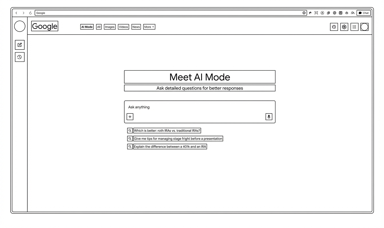 Google AI Mode
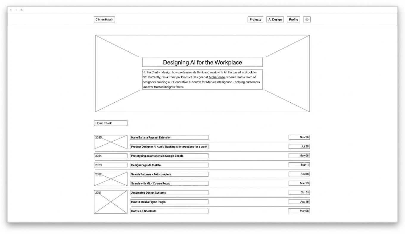 clintonhalpin.com
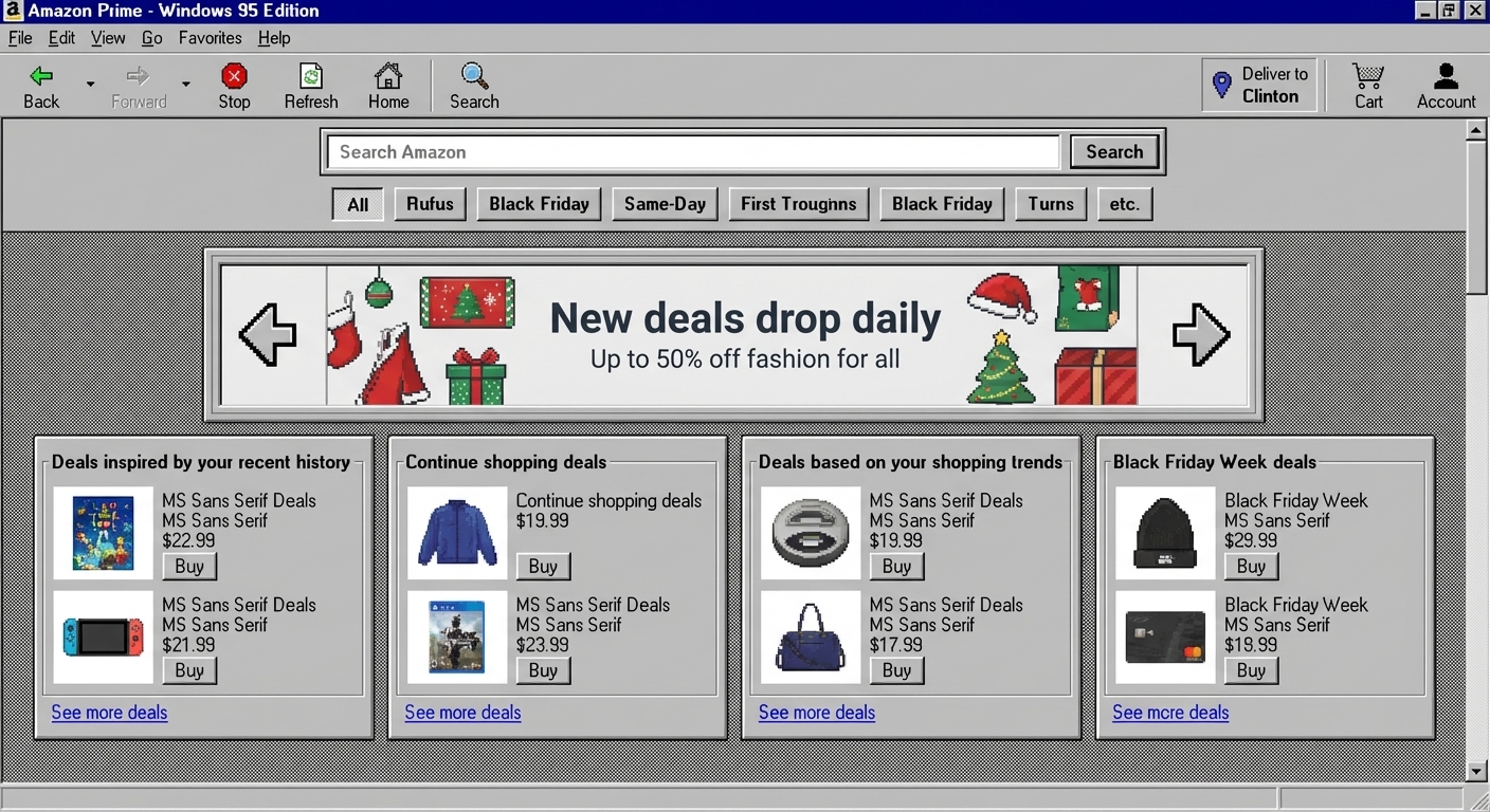
Windows 95
View Prompt
Prompt built with GPT-5
Analyze the input UI and recreate it faithfully in the visual style of Windows 95. Preserve the structure, hierarchy, and meaning of the original interface, but restyle every component using authentic Win95 system conventions.
Styling Rules (Strict)
- **Color Palette**
- Default Windows 95 grays (#C0C0C0, #A0A0A0, #E0E0E0)
- No modern gradients
- Only flat fills with dithering when appropriate
- Accent colors limited to Win95 blue (#000080), link blue, or red for errors
- **Components & Surfaces**
- 3D beveled edges using light and dark borders
- Classic title bars with left-aligned icon and window name
- System close/minimize/maximize icons in pixel style
- Scrollbars with square arrows and ridged thumb
- Tab bars with raised/unselected states
- Buttons: raised by default, sunken on interaction
- Input fields and text areas with sunken borders
- **Typography**
- Use a bitmap typeface resembling MS Sans Serif
- No anti-aliasing
- Title bars: bold or high-contrast bitmap style
- Body text: small, crisp, pixel-level sharpness
- **Layout & Interpretation Rules**
- Keep all content and functional groupings from the source
- Translate modern components into their Win95 equivalents
- If a component doesn’t exist in Win95 vocabulary, approximate with:
- A framed panel
- A menu bar
- A dialog box
- A list view
- Maintain 95-era spacing, padding, and alignment
- Keep proportions boxy and grid-driven
- No rounded corners anywhere
- **Optional Embellishments (Authentic to the Era)**
- Include subtle dithering patterns for backgrounds
- Use 16×16 pixel icons in toolbars
- Add classic desktop shadows or window stacking
- Optional “Start button + taskbar” if representing a full-screen experience
- **Output Requirements**
- Generate a single high-quality image
- Should look like a native Win95 screenshot
- No modern lighting, shadows, or rendering effects
- Pure retro UI recreation
- **Objective**
- Produce a faithful, pixel-style Windows 95 reinterpretation of the input UI, treating it as if it were redesigned by a 1995 Windows UX engineer using only the primitives and constraints available at that time.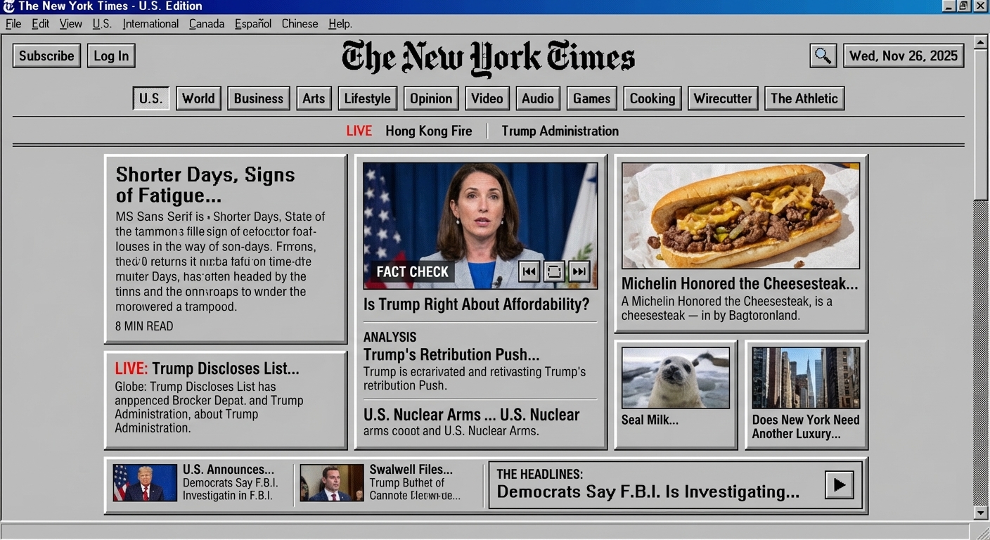 NYTimes.com
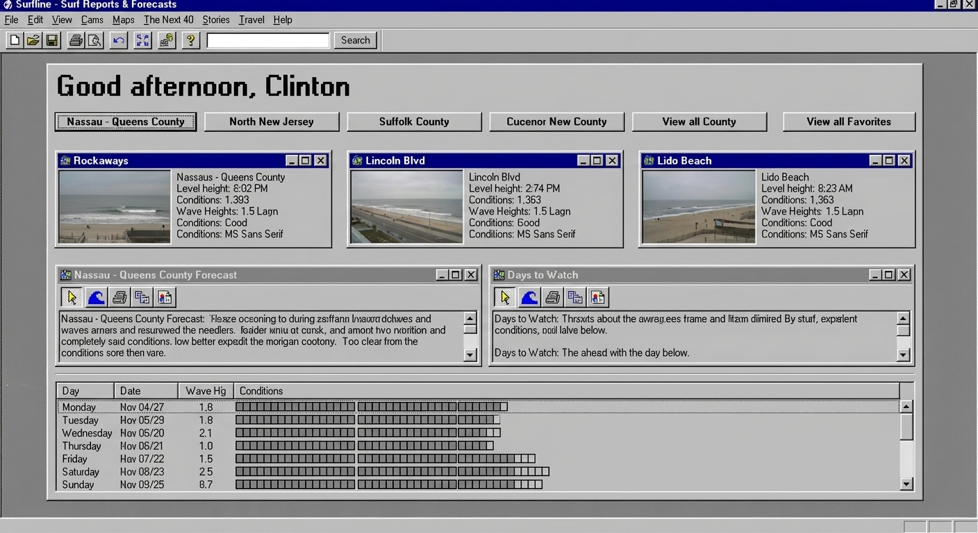 Surfline.com
 Amazon.com
5 Variants
Idea: Could we leverage nano banana to really explore and iterate on our designs? So far the model seems to jump to generic cliche patterns.
View Prompt
Prompt built with GPT-5
Transform the provided UI into 5 alternative UI concepts for the same underlying feature.
Follow these constraints exactly:

1. Preserve the Original
Place the original design exactly as provided in the top-left corner, with no edits, restyling, or reconstruction.

2. Infer the Style From the Input
Analyze the input image to understand its:
- Layout grid
- Typography
- Color palette
- Component shapes
- Density
- Spacing
- Iconography style
- Overall visual tone

All variants must stay consistent with the visual system shown in the input.

Do not introduce new stylization beyond what is already present, unless intentional

3. Variant Requirements
Produce 5 grounded, realistic product UI alternatives, not concept art, with the same dimensions as the original screenshot.
Each one should:
- Explore a different layout pattern (just for example: split view, timeline, workspace, dashboard, etc.)
- Adjust hierarchy and navigation in a usable, enterprise-normal way
- Offer a different interaction model (card view, chat-first, canvas, timeline, inspector panel, etc.)
- Preserve the functional purpose of the original design

4. Strict No-Go Zones
Do not:
- Add bright neon, 3D rendering, glossy gradients, drop shadows, glow, or sci-fi elements
- Change the component style away from what the image uses
- Invent entirely new design languages
- Over-stylize cards, borders, or text
- Use cartoonish, experimental, or playful visuals
- Introduce unrealistic spacing or decorative elements

5. Output Expectation
Render each variant as a realistic, production-grade product interface that feels like a natural extension of the original design.
Baseten.com
 Perplexity.ai
 Wikipedia.org
Minority Report
View Prompt
Prompt built with GPT-5
## System Instruction
Transform the input UI into a deeply spatial, multi-layered interface inspired by Minority Report. Prioritize dramatic 3D depth, curved planes, and stacked information layers. After the spatial layout is defined, apply a dark, cinematic color palette.
### Spatial Requirements (Very Important)
- Create strong Z-depth: multiple floating layers (foreground, mid, far)
- Introduce curved panoramic surfaces for primary content
- Add floating clusters of secondary elements orbiting the main panel
- Use parallax and perspective to make the user feel surrounded by content
- Include rails, rings, or arcs where history, timeline, or thumbnails float in 3D
- Panels should feel suspended in volumetric space, not flat or screen-based
- Maintain strong separation between the layers with soft fog, occlusion, and depth cues
### Dark Cinematic Palette (Second Priority, applied after layout)
- Background near-black or charcoal
- Panels softly illuminated with low-key lighting
- Accents in subtle graphite, white, or muted metallic
- No neon, no bright sci-fi blues
- Transparent elements tinted darker, not clear
- Light sources should feel diegetic (from panels themselves)
### Interaction Language
- Gesture-friendly interactions: grab, morph, rotate, toss, fan-out
- Expandable stacks and clusters
- Snap-to-plane or pivot-panel behaviors
- Spatial grouping that respects original hierarchy
### Faithfulness to Source UI
- Keep the original UI's content, hierarchy, and purpose
- Preserve recognizable structure while translating it into space
- Typography may be modernized but not replaced with heavy stylization
- Derive accent colors from screenshot but darken and desaturate as needed
### Output Requirements
- Single high-fidelity image
- Slight angled POV as if the user is standing at a holographic console
- No people or hands
- Depth must be dramatic and obvious at a glance
### Goal
A dark, cinematic, deeply spatial reimagining of the UI that retains the first output's spatial ambition while improving palette and mood.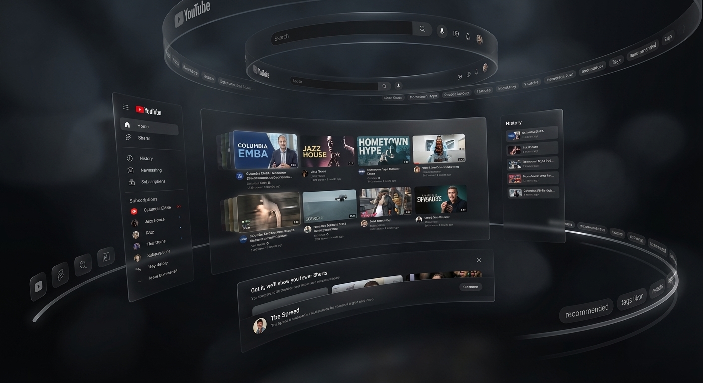 Youtube.com
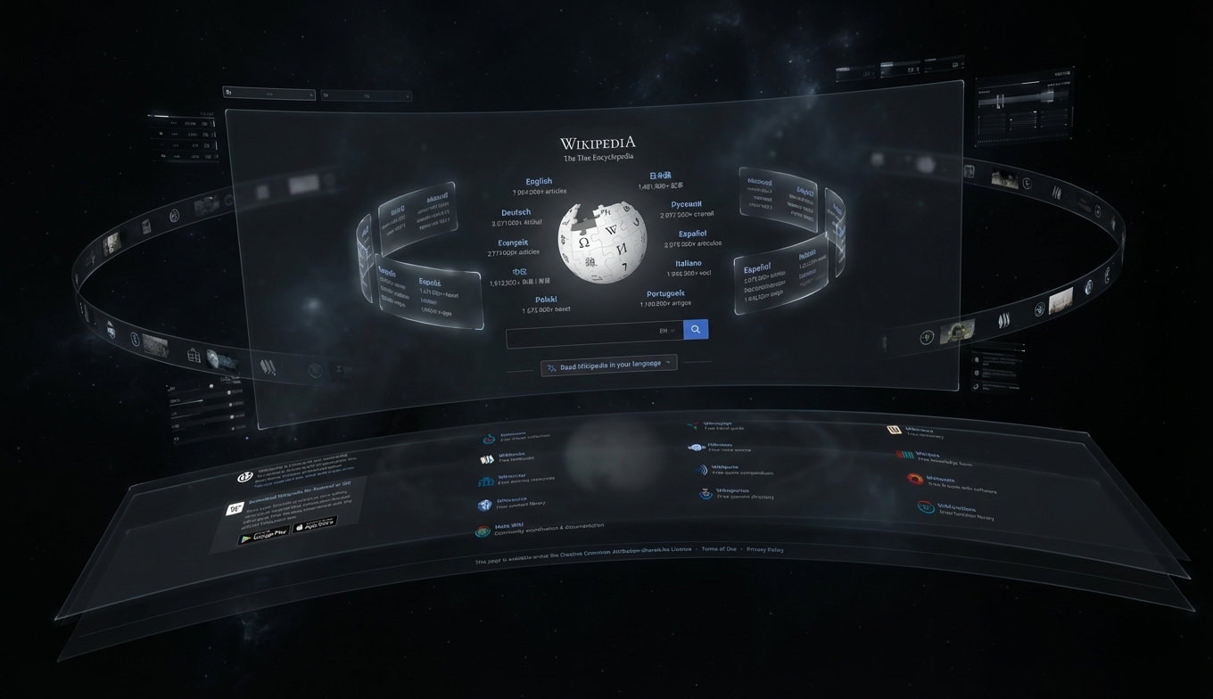 Wikipedia.org
Closing
I'll keep this page updated with new prompts and examples as I experiment with Gemini 3. You can try the extension here: